Creating Designs - The Foundations of Color

Color Choices and the Color Wheel
When choosing colors for your designs you should try to create asymmetry between your brand, your customers, and your goal. The colors of your brand will come into play when it comes to your designs.
For example, Filthy Casual uses its logo in contrasting colors of black and white depending on the garment color to create their Essentials Collection. But some of their best sellers showcase the fun ways they use color to change up their logo.
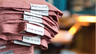
Consider your customers and their needs. What else are they wearing and what do they want to wear? If your end customer is more likely to wear muted tones, maybe choose shirts that are natural colors and designs that do not overpower the entire shirt. If you’re on the opposite end with an audience that loves bright colors, it’s important to tailor your choices to them. Brands like walk in love. use muted tones in their designs, and have stayed consistent with that look over the years.

Colors can evoke a multitude of emotions from those seeing or wearing them. Color Psychology (the study of colors) helps us understand why colors make us feel the way they do. Specific colors bring up different feelings, like how green can be calming and make us think of nature but red is very passionate and fiery. So, how does color relate to your goal and how can you better reach your goal with color?
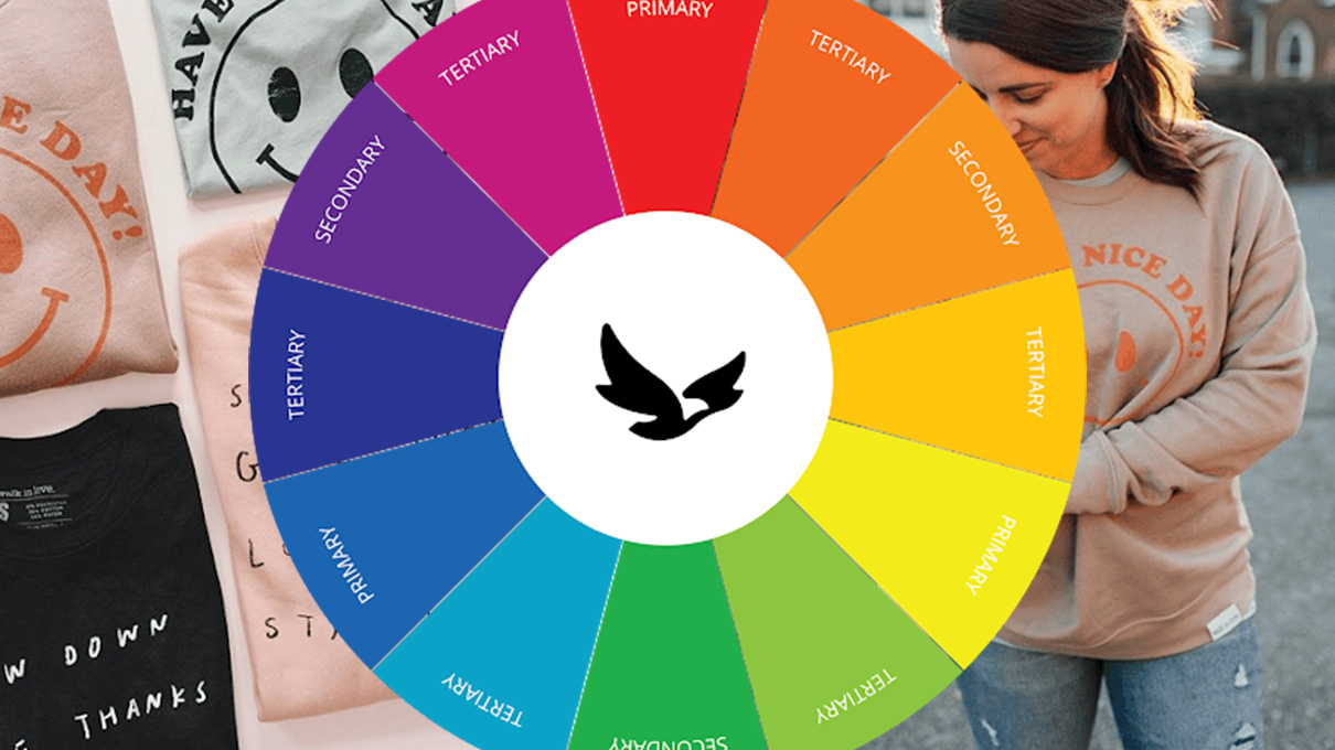
Besides just choosing colors based on emotions, a color wheel can be a useful guide to picking complimentary colors and making sure they don’t clash. The wheel splits up colors into three categories:
Primary, Secondary, and Tertiary
- Primary - Colors used to make other colors: Blue, Red, and Yellow
- Secondary - Colors mixed from the primary colors: Green, Purple, and Orange
- Tertiary Colors - Colors in between primary and secondary colors. (Most colors fall into this category)
Ways to Use a Color Wheel:
Complementary Colors
Colors that fall on opposite sides of the color wheel. For example, blue compliments orange, yellow compliments violet, and red compliments green.
Triad Colors
Three colors can be linked by making an equal triangle on the color wheel. Red, yellow, and blue make a perfect triad, providing an additional complimenting color.
There are other ways to choose a color palette that flows with your brand.
Here are some additional terms that relate to color:
- Hue: What color something is, like blue or red
- Chroma: How pure a color is; the lack of white, black or gray added
- Saturation: The strength or weakness of a color
- Value: How light or dark a color is
- Tone: Created by adding gray to a pure hue
- Shade: Created by adding black to a pure hue
- Tint: Created by adding white to a hue
Understanding and determining what colors look good with one another can be a challenge. A color tool can be a useful aid in building a unique color palette.
Adobe Color
A free Adobe color wheel generator that allows you to find colors, generate palettes, and create a gallery of color palettes for some colorful inspiration.
Coolors
This color palette generator will help you build a color from one to five different colors. It selects colors that compliment your choice and display them as an easy to view graphic.
Colormind
This color generator automatically generates color schemes and it’s an excellent way to score design ideas. Plugin the color of your favorite t-shirt to see what colors would look best with it.


